Introduction
Autocorrelation, or serial correlation, is the correlation of a signal and delayed copies of itself (i.e. with 1,2 or 3 days/weeks/months delay). The Autocorrelation with no delay is always 1.0 (perfect), and for time series with annual seasonality (like climate) the correlation with a delay representing the number of annual seasons (i.e. 12 if monthly data) is usually strong. The autocorrelation is useful for e.g. filling missing data, forecasting or for creating unbiased datasets.
In this post you will plot the autocorrelation for climate index data. Karttur’s GeoImagine Framework uses the python package statsmodel for estimation of both the normal (or full) autocorrelation function (acf) and the partial acf (pacf). The statsmodel acf and pacf functions can be used for estimating the autocorrelation for any time series data, both for plotting and for producing layers with per pixel estimation of the autocorrelation.
Prerequisites
You must have setup the Karttur’s GeoImagine Framework as described in earlier posts. You must also have added the climate indexes to the database.
The plotting functions of Karttur’s GeoImagine Framework make use of matplotlib.
Framework process
The process for plotting the autocorrelation of climate indexes (and other database recorded) time series in Karttur’s GeoImagine Framework is autocorrdbtsclimate.
Process commands
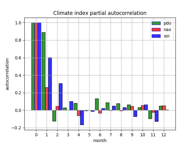
By default the autocorrdbtsclimate process performs a full autocorrelation (acf). To do a partial acf (pacf) the parameter partial must be set to True.
<?xml version='1.0' encoding='utf-8'?>
<plotdbtsclimate>
<process processid = 'autocorrdbtsclimate' version = '1.3'>
  <parameters
  ylabel='autocorrelation'
  xlabel='month'
  partial='False'
  title='Climate index autocorrelation'
  nlags='12'
  legend='0'
  width='0.9'
  grid='True'
  ></parameters>
  <index id ='pdo' color = 'g' ></index>
  <index id ='nao' color = 'r' ></index>
  <index id ='soi' color = 'b' ></index>
</process>
</plotdbtsclimate>
The xml commands above generate a plot with the three climate indexes, as shown in the left plot below (soi = Southern Oscillation Index, nao = North Atlantic Oscillation, pdo = Pacific Decadal Oscillation). The right plot shows the same indexes and time span but with a partial acf (pacf) (parameter partial set to True).